Wednesday, July 1, 2015
Coincidence Is fun
I cannot be the first person to think that the opening bits of Calamity Song by the Decemberists sounds like a slowed down version of the Age of Consent by New Order.
Fun!

Thursday, June 18, 2015
Replace pawlenty with jeb and 5 with 4
Not This Again:
http://whynotmike.blogspot.com/2011/06/growth-rates.html
Sustained super growth is only going to happen again when productivity goes up or we employ more people. In the late 90s we did pretty good with the internet but that well has gone dry. For more lucid commenting see this Jordan Weissman Post
http://whynotmike.blogspot.com/2011/06/growth-rates.html
Sustained super growth is only going to happen again when productivity goes up or we employ more people. In the late 90s we did pretty good with the internet but that well has gone dry. For more lucid commenting see this Jordan Weissman Post
Tuesday, May 26, 2015
Non definitive list of tracks referenced in Jaw Knee Music by NOFX
Please leave any suggested tracks in the comments:
https://open.spotify.com/user/lobock/playlist/5fNyPOzEjhHUZ2NzRNxpZn
Thursday, April 30, 2015
Hot Tip for Power Point Movies and Music Together
Say you got a silent movie and want to play a clip of music over it in Powerpoint. Many a fool would say go edit the movie in blah blah or pipe the blah throuch flac to blah. Fooey I say, Powerpoint can play the movie and the music at the same time.
First Insert each item into a slide.
For each Click on the Item and select Playback from the Audio or Video Tools Ribbon
Select the Play Automatically Option:
 But you say the two play consecutively, thats not what I wanted. I know I know but you can overcome this. Head to the Animation Ribbon and open the animation pane. Right Click on the second media item and set it to Start with Previous.
 Once the Animation order numbers match (blue arrows) they two clips will play together, and you audience wont know you can't use iMovie.


Monday, October 21, 2013
Monday, October 14, 2013
Flatten a square matrix in Mathcad
Mathcad is awful,
If you like me are being forced to use Mathcad after several blissful years of Mathematica then you get very sad very fast.
Here is a function to flatten a square array of square arrays in Mathcad (click to pop)

It could be extended to non-square arrays by adding a few more arguments. The advantage over the stuff on this page (current top google hit : http://communities.ptc.com/thread/38326 ) is no if-else statements and it works on matrices, not just vectors. Note the ORIGIN is set to 0
More importantly the whole mess can be avoided with creative use of the augment and stack function for array building
If you like me are being forced to use Mathcad after several blissful years of Mathematica then you get very sad very fast.
Here is a function to flatten a square array of square arrays in Mathcad (click to pop)

More importantly the whole mess can be avoided with creative use of the augment and stack function for array building
Thursday, June 20, 2013
A .mov that works in Mac Powerpoint 2011 via quicktime export.
Hey have you ever made a quicktime movie in final cut pro only to not have it work in powerpoint?
I made a movie (.mov) using final cut on a university computer and though it would play locally on my laptop in Quicktime it would not work in powerpoint. I do not have final cut or quicktime pro on my laptop.
I tired using VLC to convert it to an avi, but it would drop frames including the last one.
To do a quick conversion to get it to work open the .mov in quicktime and select File -> Export...
On the Formats Menu select anything, like 720p for instance, and export the movie.
Try it in powerpoint!
Some search terms to help land you here:
Quicktime
Mac Office 2011
Powerpoint
Convert .mov for powerpoint
Export quicktime movie
Final Cut
won't work in powerpoint
I made a movie (.mov) using final cut on a university computer and though it would play locally on my laptop in Quicktime it would not work in powerpoint. I do not have final cut or quicktime pro on my laptop.
I tired using VLC to convert it to an avi, but it would drop frames including the last one.
To do a quick conversion to get it to work open the .mov in quicktime and select File -> Export...
On the Formats Menu select anything, like 720p for instance, and export the movie.
Try it in powerpoint!
Some search terms to help land you here:
Quicktime
Mac Office 2011
Powerpoint
Convert .mov for powerpoint
Export quicktime movie
Final Cut
won't work in powerpoint
Tuesday, October 16, 2012
12 Million Jobs, Meh
Governor Mitt Romney promises to create 12 million jobs in the 4 years he would be in office, that works out to 12,000,000 / 4 / 12 = 250,000 per month. That sounds like a lot. In general it is, from 1950 to 2007 the average number of jobs created per month was 136,000. (http://data.bls.gov/pdq/SurveyOutputServlet). And compared to recent history it looks like a lot.

But is it a lot ? The average of the positive values in the data from 1950 to 2007 is 212,000. Not that much different than his promise. In fact the Romney has an almost guaranteed shot at accomplishing that goal. If we stay on the course President Obama has gotten us on we'll do just as well. Take a look at the trend started by Obama and the promised growth via Romney.
 In fact Obama's trend line, that is the slope of the net jobs curve has been curtailed by the Republicans in congress since his mid-terms. Since then there has been no stimulative spending and growth crushing partisan politics such as the debt ceiling fight. If we had maintained the policies of the first two years we'd be alot closer to that goal. Take a look at this floating average of the derivative of the Jobs Created per month. That is to say d^2 Jobs / d Month^2.
 During the first half its pretty good, the stimulus does way better than the Bush Tax Cuts. Even with the winding down of the stimulus the positive derivatives are of a larger magnitude than anything in the Bush years. If anything we need more stimulus, interest rates are low borrow now, repair bridges, jobs nows cheaper transportation tomorrow!

But is it a lot ? The average of the positive values in the data from 1950 to 2007 is 212,000. Not that much different than his promise. In fact the Romney has an almost guaranteed shot at accomplishing that goal. If we stay on the course President Obama has gotten us on we'll do just as well. Take a look at the trend started by Obama and the promised growth via Romney.


Saturday, October 6, 2012
Thursday, February 2, 2012
oh jeez its been a while
Hello, I saw a post today on Daily Kos and was like wheres the Graph? So then I clicked through to the original Ezra Klein article at the Washington Post to no avail. So with no further research or commentary on veracity here is a graph of the numbers quoted in the Daily Kos blurb.

Anyway I have been super busy with real work but anytime something from the news needs a graphing I'll be back.

Anyway I have been super busy with real work but anytime something from the news needs a graphing I'll be back.
Wednesday, June 8, 2011
Growth Rates
Tim Pawlenty took a drubbing today for saying that his super plan will generate 5% growth for a decade. One article on the subject is here at TPM. Currently the growth rate is 1.8% according to the article. Growth rates are tied to the exponential function. As much as this guys pleads with his students and now millions of viewers on Youtube the exponential function is little understood.
In this case we are going to look at continous GDP growth at a rate of 5% and 1.8% for 10 Years. The function for continous growth like compounding interest is pert or

What does that actually look like. Using the google history of US GDP I made this chart.

Five percent doesn't look that crazy based on the previous years, but a lot of people think its impossible to do that for a decade straight. In fact its never been done before.
Just to illustrate how crazy big 5% growth is lets investigate the history of the growth rate and expand his promise out a few years. The fed has GDP measured here data from the fed available here. By calculating the change in growth each quarter, taking the mean and standard deviation of the result we can get sense of typical growth rates. The resulting distribution shows how rare 5% growth is.

To compare typical growth to 5% growth lets expand our charts to 20 and 50 years. The distribution function was used to create a random growth rate for each year past 2011. At twenty years twice as long as Pawlenty is promising we get this.

Redoing it for 50 years, You can see how incredible that kind of growth would be.

So take growth predictions with a grain of salt and remember the exponential function when a politician, broker or god forbid an engineer promises you a growth rate.
In this case we are going to look at continous GDP growth at a rate of 5% and 1.8% for 10 Years. The function for continous growth like compounding interest is pert or

What does that actually look like. Using the google history of US GDP I made this chart.

Five percent doesn't look that crazy based on the previous years, but a lot of people think its impossible to do that for a decade straight. In fact its never been done before.
Just to illustrate how crazy big 5% growth is lets investigate the history of the growth rate and expand his promise out a few years. The fed has GDP measured here data from the fed available here. By calculating the change in growth each quarter, taking the mean and standard deviation of the result we can get sense of typical growth rates. The resulting distribution shows how rare 5% growth is.

To compare typical growth to 5% growth lets expand our charts to 20 and 50 years. The distribution function was used to create a random growth rate for each year past 2011. At twenty years twice as long as Pawlenty is promising we get this.

Redoing it for 50 years, You can see how incredible that kind of growth would be.

So take growth predictions with a grain of salt and remember the exponential function when a politician, broker or god forbid an engineer promises you a growth rate.
Thursday, April 21, 2011
Adding a Javascript Function to a Blogger Blogpost
I had a lot of trouble getting the income calculator java code to work in the previous post then i discovered a poorly written post that clued me in. If you copy paste java script code into the edit html portion of the blogger editor it wont work. Thats because when the post is published blogger converts carriage returns into <br > messing up the java script.
If you want javascript to work you have to put the entire javascript code block on one line. Thats an impossible task to do manually for complex code blocks. So write and test them elsewhere and then once your satisfied it works use this tool. It will strip the new lines placing the entire block of text on one line. Copy and Paste the single line version of your code into the blog editing pane in the blogger editor and you are good to go.
If you want javascript to work you have to put the entire javascript code block on one line. Thats an impossible task to do manually for complex code blocks. So write and test them elsewhere and then once your satisfied it works use this tool. It will strip the new lines placing the entire block of text on one line. Copy and Paste the single line version of your code into the blog editing pane in the blogger editor and you are good to go.
Where Do I Stand? Income disparity and me.
I was looking for a calculator that would visualize income disparity for me as an individual but I couldn't find one. The closest I came was a javascript tool created as part of the great article series: The Great Divergence by Tim Noah at Slate. He also did the excellent healthcare plan comparative series during the 08 Democratic primaries. The visual essay compiled for the series is available here . I also suggest you read the articles here.
As for that comparative income calculator:
How you compare:
$52,059
Anyway this was compiled by the folks at Slate using publicly available data This is based on a normal distribution. The actual distribution of incomes has a key outlier though, the people at the very top make a lot more than the mean. There is a football field metaphor description of this at the L-Curve. Here is a video explanation, I warn you though the voice over sounds like Ben Stein on Ambien.
So grab your tax statement, find your income percentage with the tool, and take a look at what yard line your on.
As for that comparative income calculator:
Where do I stand?
Enter your zip code and income to find out where you fall on the curve.
How you compare:
$52,059
Sources: American Community Survey (State and National Data), IncomeTaxList (Zip code data).
NOTE: All information you enter is private and will not be recorded or stored in any way.
Anyway this was compiled by the folks at Slate using publicly available data This is based on a normal distribution. The actual distribution of incomes has a key outlier though, the people at the very top make a lot more than the mean. There is a football field metaphor description of this at the L-Curve. Here is a video explanation, I warn you though the voice over sounds like Ben Stein on Ambien.
So grab your tax statement, find your income percentage with the tool, and take a look at what yard line your on.
Wednesday, April 13, 2011
Fun with Graphs: Deficit Edition
I have seen two articles that point out that if we locked the doors of the Congress and prevented anything from happening the budget would come under control in a few years. The first was at Slate by Annie Lowrey and the second was at Daily Kos had a graphic created by the Incidental economist Blog using CBO data.

Note how revenue suddenly jumps to catch up with all those piles of liabilities we have. As the articles explain there are three actions that Congress must takesto keep us in debt. The first was extending the Bush Tax Cuts which were set to expire this year and will now expire next year. The other two they do every year because if they didn't a lot of people would be mad. One annual event is renewing the Alternative Minimum Tax dodge for middle income families. The second is circumventing the codified funding of Medicare to pay doctors rates higher than they would be under the original law.
Rather than do any of those unpopular things the Republican budget choose to do other unpopular things: cut a bunch of programs and privatize medicare. Paul Ryan shows how this will save us all a bunch of money in this video as shown on the daily show last night (I couldn't find the original video.) Check out those slick graphs.
As Stewart points out with his own graphs the elimination of the Bush Tax Cuts does essentially the same thing without destroying medicare and medicaid. Thats the rub for the Republican Party, as Scott Walker and other Governors have shown. There is always room in a budget to give rich people more money. Even when confronted by serious problems the Republican solution is give rich people more money. That was the agenda of the Federal Reserve during the Banking Panic and thats the plan now that the Bush fiscal Chickens have come home to roost.
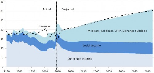
Note how revenue suddenly jumps to catch up with all those piles of liabilities we have. As the articles explain there are three actions that Congress must takesto keep us in debt. The first was extending the Bush Tax Cuts which were set to expire this year and will now expire next year. The other two they do every year because if they didn't a lot of people would be mad. One annual event is renewing the Alternative Minimum Tax dodge for middle income families. The second is circumventing the codified funding of Medicare to pay doctors rates higher than they would be under the original law.
Rather than do any of those unpopular things the Republican budget choose to do other unpopular things: cut a bunch of programs and privatize medicare. Paul Ryan shows how this will save us all a bunch of money in this video as shown on the daily show last night (I couldn't find the original video.) Check out those slick graphs.
As Stewart points out with his own graphs the elimination of the Bush Tax Cuts does essentially the same thing without destroying medicare and medicaid. Thats the rub for the Republican Party, as Scott Walker and other Governors have shown. There is always room in a budget to give rich people more money. Even when confronted by serious problems the Republican solution is give rich people more money. That was the agenda of the Federal Reserve during the Banking Panic and thats the plan now that the Bush fiscal Chickens have come home to roost.
Thursday, February 24, 2011
AAAAAHHHHHH Class
http://motherjones.com/politics/2011/02/income-inequality-in-america-chart-graph
A few Choice examples ( Click to get a clearer image )
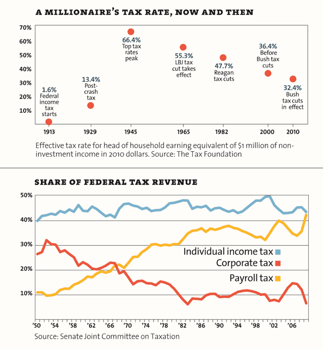
Payroll tax is only paid on the first $100,000 or so of payroll income. It is paid by the middle class and the poor.

People think they are better off than they are.
 And income disparity has gone up and up and up.
Monday, September 27, 2010
You're not rich!!!!
Unless you are, then you really really are. Im sorry but if you make more than 250K a year you are part of the upper echelon. Tim Noah at Slate wrote a 10 part series and this follow up on the subject of income and wealth disparity in the US. (http://www.slate.com/id/2268872/ )
In particular his latest article confirmed what I suspected: no one knows just how rich the rich and by extension poor they are.

So if you are getting fed up with it I have a poorly xeroxed socialist newsletter for you.

So if you are getting fed up with it I have a poorly xeroxed socialist newsletter for you.
Monday, July 26, 2010
Clone Amarok (1.2 of course) on OSX

Above is a screen shot of thje windows I have cobbled together to simulate the music listening experience of Amarok 1.2. Upper Left is of course the iTunes Window. It is on top of the album art viewer window also a part of itunes. That covers the boring bit of the Last.Fm application which loads artist info. Finally i have the tunesTEXT widget to retrieve and display lyrics.
To get the widget to stay on your desktop you have to put the Dashboard in developer mode. Which is done with the terminal.
defaults write com.apple.dashboard devmode YES
type that in terminal and you can drag widgets out from your dashboard to your desktop. just click and holding the widget while you press f12.
You can customize how itunes displays your track listing of course or ditch it altogether and use the visualizer instead of the Album art window. Here is an example using the iVisulize plugin.

PS. By the way if you use two monitors you may not be able to get visualizations to start on the secondary display. This happens to me when their default setting is full screen. I have to start the visualizer with the iTunes window on the primary display (it has the Apple Menu Bar) and then escaping from full screen. Once the visualizer is windowed you can move itunes back to the secondary display.
Friday, May 7, 2010
Kentucky Go-Fast
I spent some money on my car this spring. I broke a bolt on my car taking the resonator off my intake, so I bought some flexible intake duct ($15) and created a cold air intake for my car. It already has a K&N filter in the stock airbox. Later I was on craigslist and some one was selling some wheels. They came off a 98 neon l that had been sitting in his garage since 2006 when he tore the transmission out of it. They fit both my hubs and the exisiting tires on the car so i bought them for $35 per wheel. They are 5 spoke borbet wheels that are 15x7, the exisitng tires are 205/60 Nokian i3. Another $100 in mounting balancing and lug nuts resulted in this:

The air intake sits behind that black inlet in the bumper. The wheels increased the track width such that the tires are flush with the fenders at the top of the arch where before there were flush with the fenders at the bottom of the arch.

The air intake made the car louder, and resulted in a increase in mileage 30 mpg over my previous 28 mpg.

The air intake sits behind that black inlet in the bumper. The wheels increased the track width such that the tires are flush with the fenders at the top of the arch where before there were flush with the fenders at the bottom of the arch.

The air intake made the car louder, and resulted in a increase in mileage 30 mpg over my previous 28 mpg.
Halfway there

The Recovery Website reported new numbers on April 30th, an uptick in spending means the alloted money is now half spent.
Friday, April 2, 2010
itunes 9.1 ipod wont sync fix
I have a second generation Ipod, and after updating to itunes 9.1 it would not sync without timing out, or crashing itunes. There were several file in use errors. To rectify this follow these steps:
OPen Itunes and goto Preferences->Devices
Check Prevent Syncing Automatically
Plug in your iPod.
Deselect any dynamic playlists.
Hit Apply
That worked for me and i hope it works for you
Subscribe to:
Posts (Atom)

